Case Study: A Product Detail Page

Joining customer and company needs to drive e-commerce for a membership subscription program.

For this project, I researched solutions, created sketches, and then came up with a variety of mockups. I worked with a project manager, developer, and a senior UX staff member to choose and implement the best solution.


Product work shared with kind permission from Golden Peak Media.

The Problem

As my company set out to launch a new craft and pattern subscription membership program, I was tasked to come up with a product detail page.  I set out to answer the question, how could our company offer users a variety of purchase options while emphasizing our new membership plan. 

Functionality Must-Have’s: 
  • Option to purchase a single pattern
  • Option to purchase a membership
    • 3-month term
    • Annual  term
 
UI Must-Have’s:
  • Highlight savings and membership benefits
The Solution

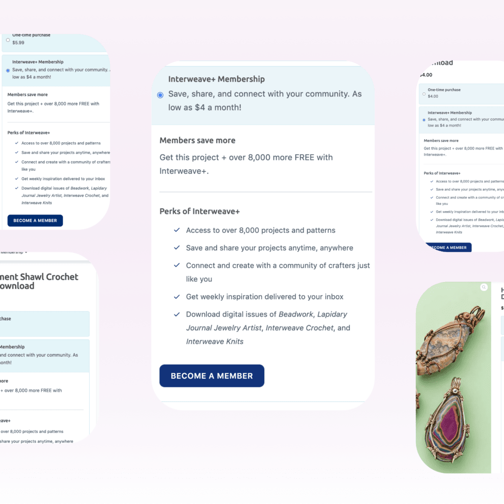
I researched various alternatives such as dropdowns, radio buttons, multiple screens, etc.  After completing cross-industry competitive research, I settled on this intuitive drawer effect.  This solution created a clean UI while holding all the information we needed on a single page-giving the user a streamlined shopping experience.

I researched various alternatives such as dropdowns, radio buttons, multiple screens, etc.  After completing cross-industry competitive research, I settled on this intuitive drawer effect.  This solution created a clean UI while holding all the information we needed on a single page-giving the user a streamlined shopping experience.

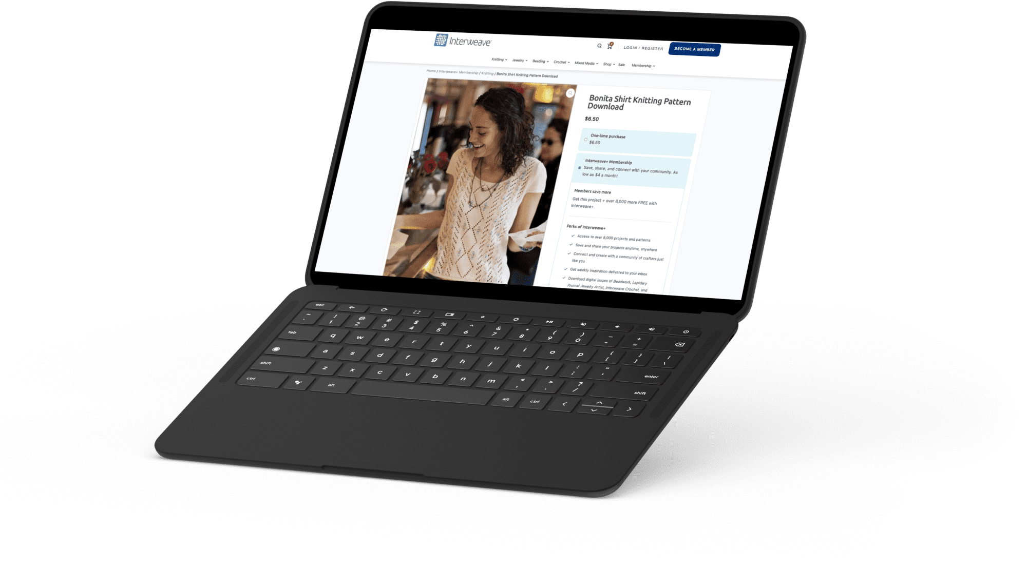
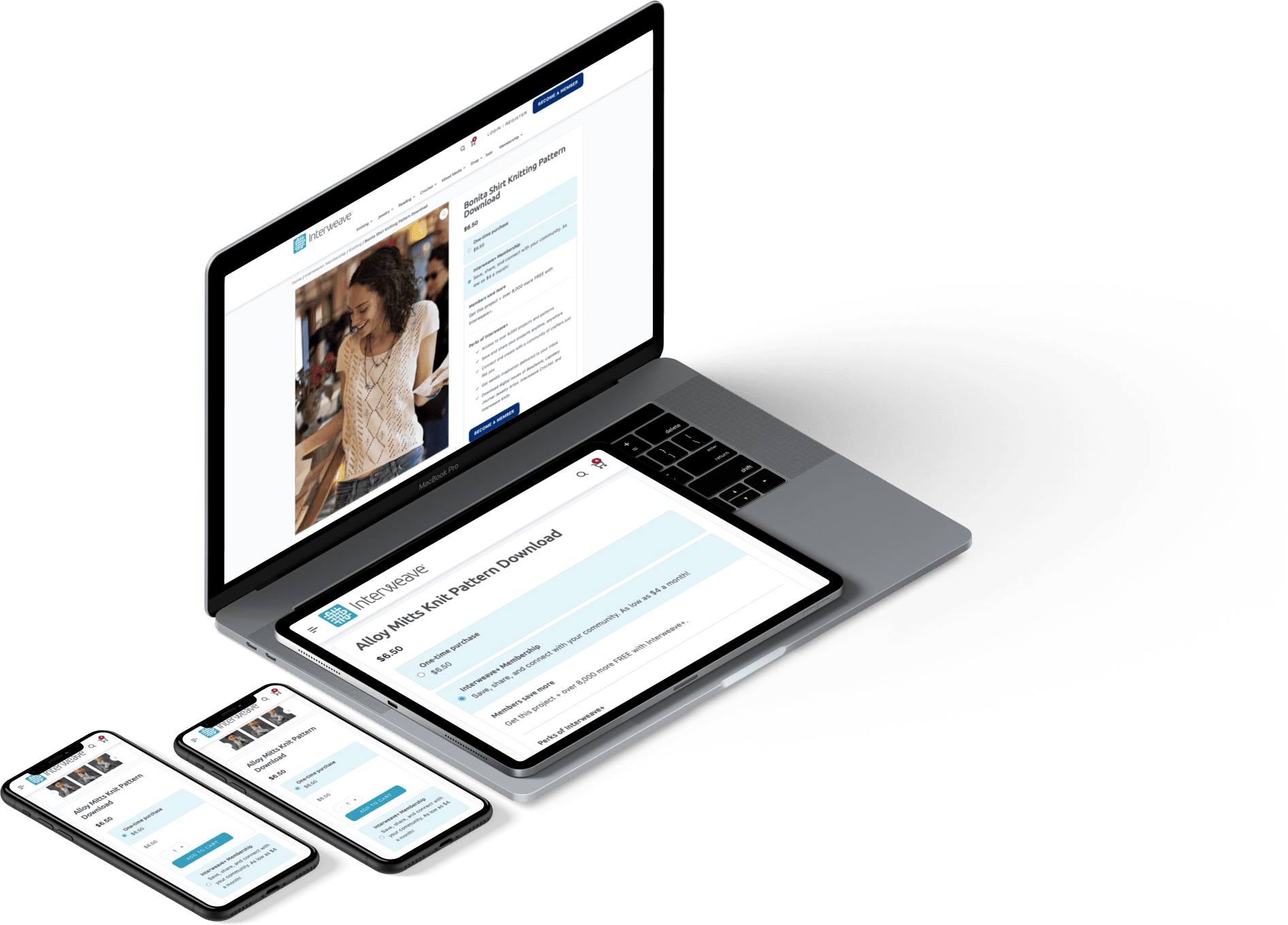
Mockups in device

The Results

Our top-selling product is now annual membership, with all memberships bringing in more than $35k since our launch 2 months ago.  My design of this product detail page answered our initial problem-users can now easily navigate all offerings and are more enticed to buy our membership rather than a single pattern.